
Too many matches, too little signal
Most matrimony apps show you hundreds of profiles. Very few feel genuinely relevant.
Open a typical matrimony app and the homepage shows a wall of profiles. Hundreds visible. Thousands behind the scroll.
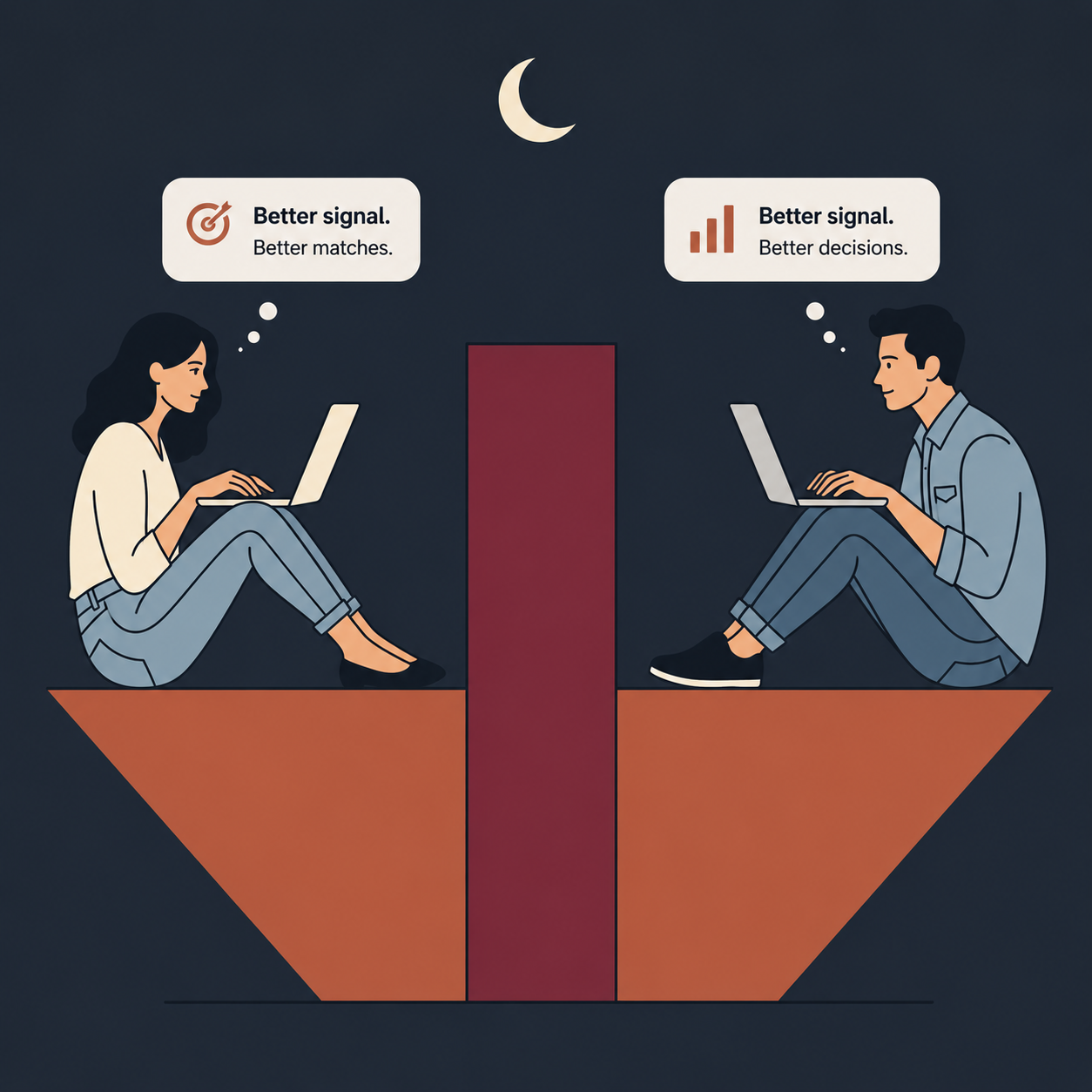
It feels like abundance should help. It is the opposite. The volume of profiles, presented without meaningful ranking, is the single biggest reason serious users give up.
When you face 200 choices that are each roughly similar, your ability to decide does not improve. It fades. Psychologists call it decision fatigue. It shows up in restaurant menus and retail aisles. It shows up worse in matrimony, where the stakes feel enormous and the differences between profiles feel marginal.
A day in the app
Open the app after work. Thirty new profiles. Skim the first five. Education fits. Religion matches. Age range works. Three-line bio. Move on.
By profile fifteen, you have stopped reading bios. By twenty-five, you are deciding on the photo. By thirty, you close the app, vaguely tired, with the sense that you saw a lot and decided nothing.
You did not choose what matters. You chose what could be processed in two seconds.
Bigger pools, smaller decisions
In real estate or job search, more inventory helps. Clear criteria, low cost of skipping. In matrimony, the opposite happens.
Every profile you open is a small emotional decision. The first ten are manageable. By the fiftieth, your brain stops engaging, the same way it stops engaging past page three of a menu. You do not become a better judge of compatibility as the pool grows. You become a more impatient one.
The better product designs for fewer, more meaningful introductions. The platform that does not just keeps showing more, because more is what the dashboard measures.
What curation actually looks like
A serious matrimony product should show very few profiles per session, not many.
Each one should be a deliberate suggestion, scored against the user's preferences, the family's context, and the profiles they have engaged with before. The system should explain why this person was surfaced, in one sentence, before attention shifts to the photo.
The number per day should be small enough that each profile is read fully. Twenty is too many. Two hundred is noise.
Signal beats volume
For a single, the right question is not "how many profiles did I see today?" It is "did I see one I would actually pursue?"
For a parent, it is not "how many profiles can I gather this week?" It is "did I send one worth talking about?"
For the platform, the right metric is not profiles shown. It is decisions made, and the warmth of those decisions in the weeks that follow.
That is what we are building at RishtaConnects. Family-aware suggestions, capped per day, designed for the way a real decision gets made.
Two profiles, one decision.The volume problem is a design problem. The product should solve it for you, not ask you to scroll harder.